Don’t want to spend hours on Photoshop editing Instagram pictures? Try out my simple editing method below!
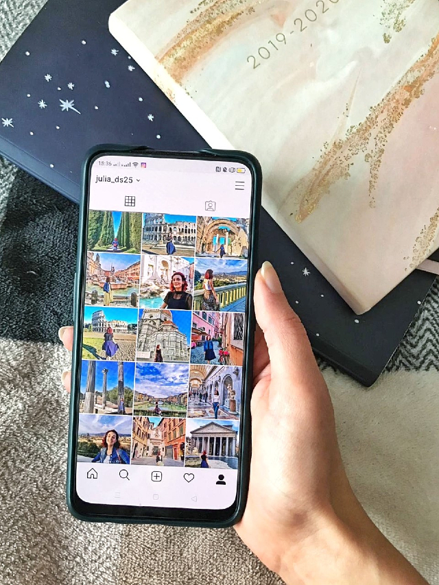
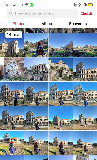
I have been asked a few times to share my editing tips on Instagram, and I thought that a blog post would help out those of you who would like to find fuss-free, easy to grasp methods for improving your Instagram photos. In this post, I will tackle simple editing only, to help you enhance the natural beauty of your photos. Travel photos, portraits, candids… Learn how to improve your photos before you post them! For the purpose of this guide, I have taken some screenshots of my phone screen during my editing process. I hope this helps!
STEP 1 – FINDING THE RIGHT PHOTO
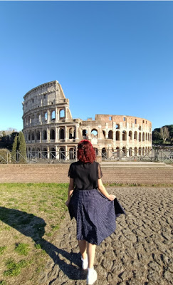
First thing is of course to look through your photo and find one that works. Everyone has a different way of taking photos for Instragram, but here’s what I do: I take photos at a specific location that I enjoy, with an outfit that I enjoy too, and from there I try multiple angles, movements, knowing that 3/4 of the photos won’t be useable for one reason or another – too light, too dark, weird face, arms wiggling around or mouth half open while I shout instructions to my Instagram husband (who can relate here? haha)
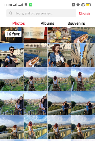
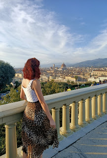
The photos I like the most are those where there is good natural light, where I have little background “noise” (people, bins, unwanted elements that take away from the beauty of the photo) and where I feel that the atmosphere of the place, or the idea I’m trying to communicate, comes through. I like to see good, even composition, where a couple elements catch the eye in harmony in the frame. For example, here are different photoshoots I’ve done and the final picture I chose for each:
STEP 2 – THE BASIC EDITING
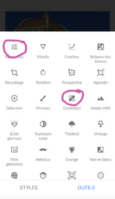
Note that for most of my editing process, I use the app Snapseed – it’s free, comprehensive, and easy to use! My app is in French so all the words are in French here, but you can easily find the equivalent tools in English on the app.
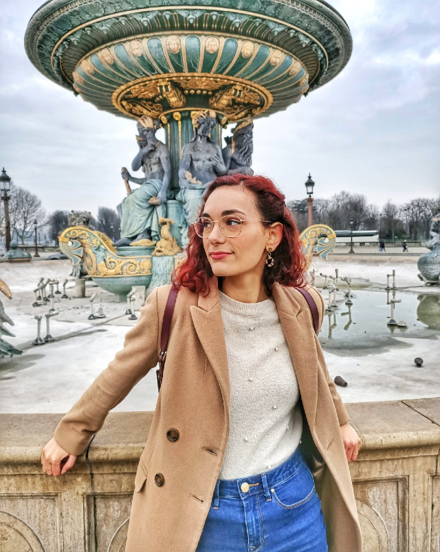
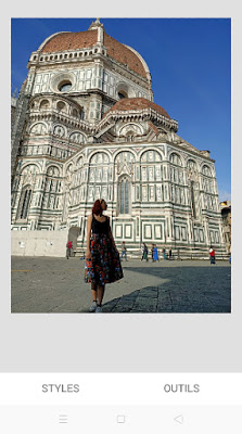
Let us focus on one, specific photo: my picture in front of the Duomo in Florence. It’s an interesting one to use because there are many details about it that I needed changed – the busy background, of course, but also the light, saturation and harmonization of the two main elements on the picture, the Duomo and myself.
The first things I always do, and often in the same order, are:
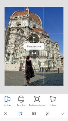
reframing the photo – tilting the perspective – using the healing tool to remove unwanted details
I often reframe the pictures a little to remove some side-elements that aren’t part of the main photo I want, but also to refocus the attention, for example by cutting off floor or sky detail when they are unecessary. For this specific photo however, since the top of the Duomo and part of my feet are in the frame, I am leaving it as-is. I then use the perspective tool to play around with depth. I personally like to pull the pespective tool up so that I look taller in pictures, and also so that it looks like it’s been taken from below, which works great in my opinion with pictures including tall building like the Duomo – same with the Eiffel tower, a pretty doorway, etc.
Then I use the healing tool for the tedious part: removing elements that I don’t want in the picture. The correction tool may need a bit of time to get used to, but once you get the gist, it’s a really helpful feature. I use it to erase people in the background (a little bit of magic never hurt anyone!) but also some minor elements like cigarette buds on the floor, random stains, and on this picture, I also removed the papers stuck to the construction display on the left-hand side (yes, I know. I’m fussy.)
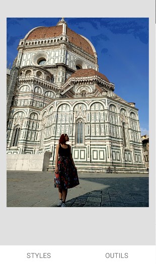
Once this is done, that gives me pretty much the final photo – without all the editing work on lights, colours, etc. This is our next step!
STEP 3 – LIGHT, CONTRAST, HDR (NO PRESETS!)
I don’t use presets or rely only on filters to edit the colours of my photos, just because to me each photo is unique, and so is each location, so I don’t think there is a one-size-fits-all for me. I would rather spend time tweaking each of the photos I create until it looks exactly as it should. This is obviously more time-consuming than throwing a filter here and there and sticking to a one-filter feed theme on Instagram, but I like the variety! Of course for coherence, because I do like a coherent theme, I tend to give the same type of colours and “vibe” to pictures that belong to the same feed – I mostly do seasonal feeds at the moment.
On Snapseed, I first use the tune image tool and adjust shadows (be careful not to remove too many shadows though, because underneath the picture becomes grainy). I also always turn up the highlights on the photo, because it’s a great way to give more brightness to your photos without using the brightness tool itself, which often casts a sort of white shadow on the picture. With highlights, the brightness comes from within certain elements of the photo, which makes it very harmonious. I also use ambiance for an easy colour and contrast fix – it’s a tool that really enhances the photos, however it does make the saturation and warmth of the photos go up so you may have to adjust that after using the ambiance tool. Whenever I use it I find that it makes my skin look almost orange, so bear in mind that this tool should be used lightly and always balanced out with more precise editing. Which leads us to step 4…
STEP 4 – USING THE BRUSH TOOL THE FINE LIGHT + COLOUR DETAILS
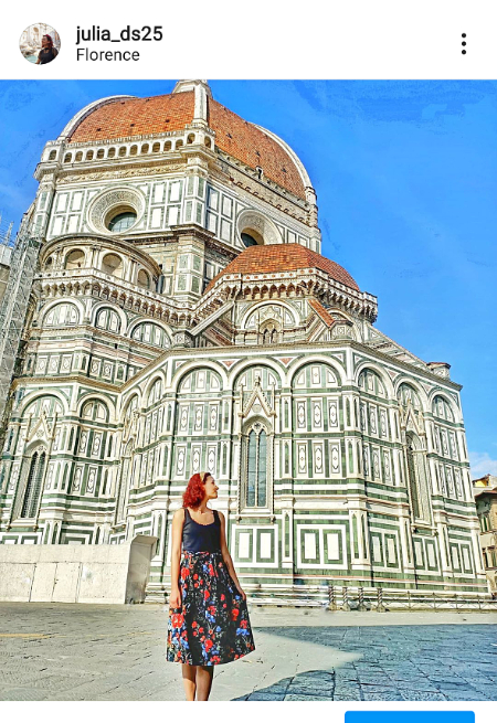
Using the brush tool, I zoom in the picture to change up smaller details – like toning down my skin (with the contrast pen) when the other editing tools make it look orange. I also uuse the contrast pen, set to -3, to highlight some details in the pictures by making them appear darker. For example in the Duomo picture, I made the top part of the Duomo stand out by using this contrast tool with the brush. I use the saturation tool to make colours brighter in the background sometimes, or on my outfits when the colours have somehow been washed out by the editing. If you’re not too fussed about the details you could of course skip those more minute steps, but I like a well-rounded picture and think that even the smallest details are important in the content I create.
What about HDR? It’s a tool I’ve seen a lot of content creators use over time, sometimes a bit too much for my own taste – HDR makes your pictures grainier, and let the smallest details stand out with a lot of contrast. I tend to use the HDR tool to give more depth to my pictures – to highlight the details of buildings, or of sky backgrounds – but my advice when you do so is to always keep the picture very bright and light, as HDR will make your pictures darker. I would suggest using it with parsimony, but it can definitely add a little something to photos – and make skies and clouds look spectacular!
Once all of this is done, the Snapseed editing process is complete!
PICTURE IS READY TO POST… HERE!
(Between the moment I wrote this post and published it, I changed my Instagram username to match my blog! Feel free to check out my page for more fun photography and travel adventures!)
I would really like to make a more comprehensive Instagram photo editing guide, maybe a downloadable one, so please let me know if that would be something you’d like to read – I would get into more detail about creative edits and all the other apps I use to edit my photos more extensively!
What are your best tips to edit Instagram photos? What apps do you use? Let’s share our best tips below!
Lots of love,
Julia x